Table of Contents
What is Statistical Quality Control?
The main objectives of the manufacturers or the producer is to achieve quality assurance in manufacturing and service organization. for achieving those objectives, different statistical tools have been developed. These are very useful for controlling the quality of the products vis-a-vis the specifications or standard. The technique of using statistical quality control is a proactive strategy within the broader Quality Control umbrella. It leverages statistics to analyze data collected during production, helping identify trends, variations, and potential problems before they snowball into major quality issues.
Statistical Quality Control is a technique of applying statistical methods based on the theory of probability and sampling to establish quality standard and to maintain it in the most economical manner.
Elements of Statistical Quality Control
The elements of Statistical Quality Control (SQC) work together to form a data-driven system for monitoring and improving processes. Here’s a breakdown of the key components:
- Data Collection: The foundation of Statistical Quality Control lies in gathering measurable data throughout various stages of production or service delivery. This data can be quantitative (numbers, measurements) or qualitative (descriptive observations). Examples include product dimensions, weight, performance metrics, customer satisfaction scores, or even error rates in a service process.
- Statistical Tools: Statistical Quality Control utilizes a toolbox of statistical methods to analyze the collected data. Here are some essential tools:
- Control Charts: These graphical representations track data points over time, establishing control limits (upper and lower bounds) based on statistical analysis. Deviations from these limits signal potential issues that warrant investigation. There are different control charts for various data types, like X-bar charts for averages or c-charts for defect counts.
- Statistical Process Control (SPC): This methodology heavily relies on control charts to identify and eliminate assignable causes (non-random variations) of defects. By analyzing control charts for trends and patterns, SPC helps identify areas needing corrective action to bring the process back into control.
- Capability Studies: These analyses compare the natural variation inherent in a process (its capability) to the product specifications. Capability studies help determine if the process can consistently produce conforming products that meet quality standards.
3. Analysis and Interpretation: Once the data is collected and analyzed using statistical tools, Statistical Quality Control professionals interpret the results. They identify trends, potential problem areas, and opportunities for improvement in the process. This analysis involves expertise in statistical methods and a deep understanding of the specific production or service being monitored.
4. Corrective Action: Based on the analysis and interpretation, corrective actions are recommended to address any identified issues. This might involve adjusting process parameters, improving equipment calibration, or implementing new training procedures for employees.
5. Continuous Improvement: Statistical Quality Control is an ongoing process that fosters a culture of continuous improvement within a business. By regularly monitoring and analyzing data, businesses can identify areas for improvement and implement changes to optimize processes, reduce defects, and ultimately achieve consistent quality.
These elements work together to create a data-driven approach to quality control. By collecting the right data, using appropriate statistical tools, and interpreting the results effectively, businesses can leverage Statistical Quality Control to achieve operational excellence and deliver superior products and services.
Techniques OF Statistical Quality Control
Here are some of the techniques of statistical quality control which can be classified into two categories:
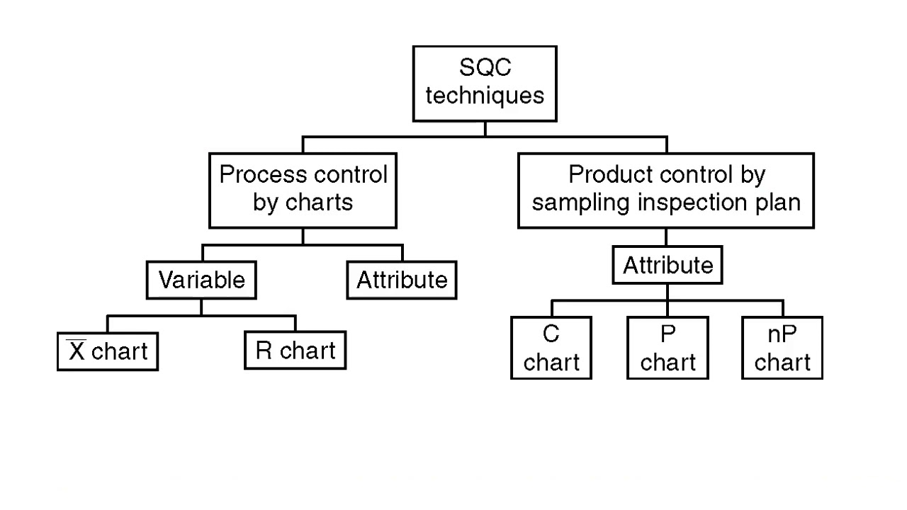
Fig: classification of Statistical Quality Control Techniques
Statistical Process Control
Statistical Process Control is a technique used for understanding and monitoring the process by collecting data on quality characteristics periodically from the process, analyzing them and talking suitable actions whenever there is a difference between actual quality and the specifications or standard.
It is a widely used technique in the process for achieving process stability and making in product quality. the major tools are :
1.Histogram
2. Check Sheet
3. Pareto Chart
4. Cause and effect Diagram
5. Process Flow diagram
6. Scatter diagram
7. Control Chart
1. Histogram
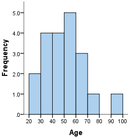
It is a series of rectangles, each proportional in width to the range of values within a class and proportional in height to the number of items falling in the class. It is used to describe numerical data which have been grouped into frequency, relative frequency or percentage distribution.
histograms are of two types:
- with equal width classes
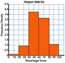
When all the class intervals in a histogram have the same width, they are considered “equal width class intervals.” Imagine a ruler where each tick mark represents one unit. An equal width histogram would group data points into intervals that span the same number of units on this ruler. For instance, you might have class intervals ranging from 0-5, 6-10, 11-15, and so on.
- with unequal width classes
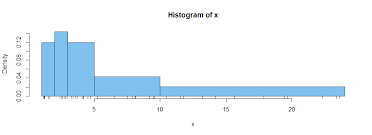
Unlike their equal width counterparts, unequal width class intervals have varying widths on the horizontal axis (X-axis) of a histogram. This means some bars might represent larger ranges of values than others.
2. Check Sheet
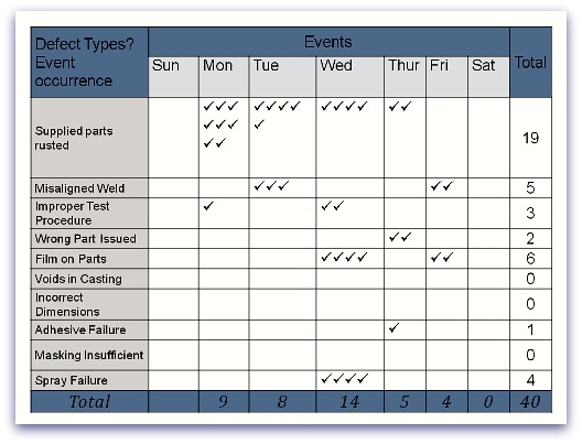
A check sheet, also known as a defect concentration diagram, is a fundamental tool within the realm of Statistical Quality Control (SQC). It acts as a simple yet powerful data collection form used to record the occurrence of specific events or defects during a process.
Imagine a structured form with rows and columns. Rows might represent different stages in a production process, while columns might list potential defects or areas for inspection. The beauty of a check sheet lies in its simplicity:
- Recording Data: Observers or inspectors simply mark the sheet with checkmarks, tallies, or brief notes whenever they encounter a specific event or defect.
- Quick and Easy: This straightforward approach allows for rapid data collection without the need for lengthy written descriptions.
Benefits of Check Sheets:
- Improved Data Collection: Check sheets provide a standardized format for data collection, ensuring consistency and reducing errors.
- Real-Time Data Capture: Data is recorded at the time of observation, minimizing the risk of memory lapses or incomplete information.
- Identifying Trends: By reviewing completed check sheets over time, trends and patterns in defect occurrence become apparent. This helps pinpoint areas requiring corrective action.
- Simple Analysis: The visual layout of check sheets makes it easy to identify frequently occurring defects or process stages with higher error rates.
- Communication Tool: Check sheets serve as a clear and concise communication tool, fostering discussions about quality issues between team members.
Types of Check Sheets:
- Attribute Check Sheet: Focuses on the presence or absence of specific qualities or defects (e.g., a checklist for scratches or dents on a product).
- Variable Check Sheet: Records the measured value of a specific characteristic (e.g., weight, dimension).
- Process Flow Check Sheet: Tracks the completion of various steps within a process.
Beyond Manufacturing:
While check sheets are prevalent in manufacturing for quality control, their applications extend to various fields:
- Service Industries: Tracking customer complaints or errors in service delivery.
- Healthcare: Monitoring medication administration or documenting patient observations.
- Construction: Recording safety hazards or deviations from building specifications.
In essence, a check sheet is a versatile tool that empowers businesses to gather quality data efficiently, identify areas for improvement, and ultimately achieve consistent quality in their products or services.
3. Pareto Chart
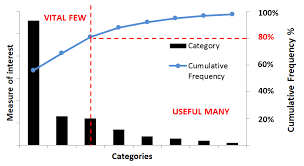
A Pareto chart, also known as a Pareto diagram or Pareto analysis, is a graphical tool that combines elements of a bar chart and a line graph to effectively illustrate two key principles:
- The Pareto Principle (80/20 Rule): This principle, popularized by Italian economist Vilfredo Pareto, suggests that roughly 80% of the effects (defects, customer complaints, etc.) often arise from 20% of the causes.
- Prioritization: By visually highlighting the most significant factors, a Pareto chart helps prioritize improvement efforts.
Structure of a Pareto Chart:
- Bar Chart: The chart uses vertical bars to represent the frequency or cost (time or money) of various categories or causes being analyzed. The bars are arranged in descending order, with the tallest bar on the left representing the most frequent cause and subsequent bars decreasing in height.
- Line Graph: A line graph superimposed on the bars depicts the cumulative total of the frequencies or costs represented by the bars, typically expressed as a percentage.
Benefits of Pareto Charts:
- Visually Powerful: The combined bar and line graph format creates a visually compelling presentation, making it easy to identify the most significant factors at a glance.
- Prioritization Tool: By highlighting the 20% that contributes to 80% of the issues, a Pareto chart helps focus improvement efforts on areas with the greatest potential impact.
- Problem-Solving: Pareto charts aid in brainstorming solutions by pinpointing the root causes of problems.
- Data Communication: They offer a clear and concise way to communicate insights from data analysis to stakeholders.
Applications of Pareto Charts:
Pareto charts find application in various domains, including:
- Quality Control: Identifying the most frequent defects or causes of product failures.
- Customer Service: Prioritizing customer complaints based on their frequency and impact.
- Sales and Marketing: Focusing resources on the most profitable customer segments or marketing channels.
- Project Management: Identifying the tasks or activities that contribute most to project delays or cost overruns.
- Inventory Management: Highlighting the items with the highest stock turnover or value.
By leveraging the Pareto principle and its visual representation in a Pareto chart, organizations can effectively prioritize their efforts and achieve significant improvements in various aspects of their operations.
4. Cause and effect diagram
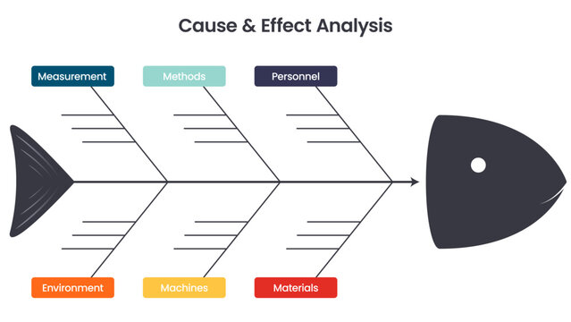
A cause and effect diagram, also known as a fishbone diagram or Ishikawa diagram (after Kaoru Ishikawa, who popularized it), is a visual tool used to identify and organize the potential causes of a specific problem or effect. It is a core component of problem-solving methodologies like Six Sigma and plays a valuable role in various fields, including quality control, manufacturing, and business process improvement.
Structure of a Cause and Effect Diagram:
- Main Branch (Head): This horizontal line at the right end of the diagram represents the problem or effect being investigated.
- Fishbone (Backbone): A main branch slants down from the left towards the head, representing the major categories of causes that might contribute to the problem. Common categories include People, Methods, Materials, Equipment, and Environment (sometimes referred to as MMEE). Additional categories can be added depending on the specific situation.
- Sub-branches: Each major category branch further divides into sub-branches, which represent more specific potential causes related to the main category. For example, the “People” category might have sub-branches for “Training”, “Skills”, or “Communication”.
- Causal Factors: The finer sub-branches culminate in specific factors that could be contributing to the problem. These are the areas to be investigated and addressed.
Benefits of Cause and Effect Diagrams:
- Visual Thinking: The fishbone structure promotes visual thinking, making it easier to brainstorm and organize potential causes in a clear and structured manner.
- Teamwork: It fosters collaborative problem-solving by encouraging team members to contribute their ideas and perspectives.
- Root Cause Identification: By systematically exploring various categories of causes, the diagram helps identify the root causes of the problem, not just the symptoms.
- Preventative Action: Understanding root causes allows for taking preventative actions to address the problem at its source and prevent future occurrences.
How to Create a Cause and Effect Diagram:
- Define the problem: Clearly identify the issue you are trying to analyze.
- Brainstorm Main Categories: Determine the major categories of causes that might contribute to the problem (e.g., MMEE or customized categories).
- Develop Sub-branches: For each main category, brainstorm and list specific potential causes as sub-branches.
- Refine and Discuss: Refine the diagram by removing irrelevant causes and ensuring all branches connect logically to the main problem. Encourage team discussion to explore all possibilities.
- Identify Root Causes: Analyze the diagram to identify the most likely root causes of the problem.
Cause and effect diagrams are a valuable tool for problem-solving and continuous improvement. By visually mapping out potential causes, organizations can effectively identify the root of problems, prioritize solutions, and prevent future occurrences.
5. Process Flow Diagram
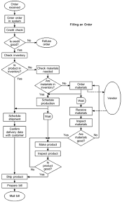
A process flow diagram (PFD), also sometimes called a flow sheet, flowchart, or process map, is a visual representation of the steps and decisions involved in a process. It’s a fundamental tool used across various industries to illustrate the flow of materials, information, or services within a system.
Purpose of Process Flow Diagrams:
- Process Documentation: PFDs provide a clear and concise way to document a process, promoting understanding and knowledge sharing among team members. This is especially useful for complex processes or when onboarding new employees.
- Communication: They serve as a universal language, facilitating communication about a process between technical and non-technical audiences.
- Analysis and Improvement: PFDs aid in analyzing a process to identify bottlenecks, inefficiencies, or areas for improvement. By visualizing the flow, it’s easier to spot potential problems and opportunities for optimization.
- Standardization: They can be used to define a standard way of performing a process, ensuring consistency and quality in the outcome.
- Training: PFDs can be instrumental in developing training materials for employees involved in the process.
Components of a Process Flow Diagram:
- Start and End Points: The diagram clearly indicates the beginning and end of the process.
- Process Steps: Each step involved in the process is represented by a specific symbol (e.g., rectangle for a task, diamond for a decision point).
- Flow Lines: Arrows connect the symbols, illustrating the sequence of steps and the direction of the flow.
- Inputs and Outputs: The PFD might show the materials, information, or data entering and exiting the process at each stage.
- Decision Points: Branching arrows with labels represent decision points where a choice needs to be made, often based on specific criteria.
Types of Process Flow Diagrams:
- High-Level PFD: Provides a broad overview of the main process steps, suitable for communication to a general audience.
- Detailed PFD: Delves deeper, including more specific details about each step, inputs, outputs, and decision criteria.
- Cross-Functional PFD: Maps out a process that involves multiple departments or teams, highlighting interactions and handoffs.
Who Uses Process Flow Diagrams?
PFDs are used by a wide range of professionals, including:
- Engineers: To design, document, and communicate manufacturing processes.
- Business Analysts: To map out business workflows and identify areas for improvement.
- Project Managers: To visualize project timelines and dependencies between tasks.
- Software Developers: To illustrate the flow of data within a software application.
- Customer Service Representatives: To understand customer journey maps and identify potential service bottlenecks.
By creating and utilizing process flow diagrams, organizations can achieve greater clarity, efficiency, and consistency in their operations.
6. Scatter Diagram
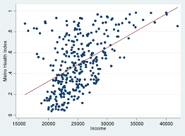
A scatter diagram, also known as a scatter plot, scatter graph, or correlation chart, is a graphical tool used to explore the relationship between two continuous variables. It allows you to visually analyze how changes in one variable might be associated with changes in the other variable.
Visualizing Relationships:
Imagine you have data on weight and height for a group of people. A scatter diagram would plot each person’s weight on the horizontal axis (X-axis) and their height on the vertical axis (Y-axis). Each data point would be represented by a dot or symbol on the graph.
By looking at the overall pattern of the dots, you can identify trends or relationships between the two variables. Here are some possible scenarios:
- Positive Correlation: If the dots show a general upward trend from left to right, this suggests a positive correlation. As the values on the X-axis increase, the values on the Y-axis tend to increase as well.
- Negative Correlation: A downward trend from left to right indicates a negative correlation. Higher values on the X-axis tend to correspond to lower values on the Y-axis.
- No Correlation: If the dots appear randomly scattered throughout the graph, there is no clear relationship between the two variables.
Benefits of Scatter Diagrams:
- Visual Insights: Scatter diagrams offer a quick and easy way to visualize the relationship between two variables, complementing numerical analysis with a clear visual representation.
- Identifying Patterns: They help identify trends, outliers, and potential non-linear relationships that might not be evident from just looking at raw data.
- Hypothesis Generation: By observing the patterns in a scatter diagram, you can generate hypotheses about the cause-and-effect relationship between the variables. However, it’s important to remember that correlation doesn’t imply causation.
When to Use Scatter Diagrams:
Scatter diagrams are most effective for continuous variables where values can fall anywhere along a spectrum. They are ideal for:
- Exploring relationships between two variables before further statistical analysis.
- Identifying outliers that might skew the data analysis.
- Comparing relationships between different groups or categories within the data.
Limitations of Scatter Diagrams:
- Strength of Correlation: Scatter diagrams don’t tell you the strength of the correlation between variables. Statistical measures like correlation coefficients are needed for a more precise understanding.
- Causation vs. Correlation: As mentioned earlier, correlation doesn’t imply causation. Just because two variables appear related in a scatter diagram doesn’t necessarily mean one causes the other.
7. Control Chart
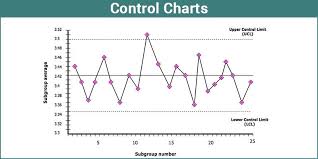
In the realm of Statistical Quality Control (SQC), control charts reign supreme as graphical tools used to monitor and track how a process performs over time. They act as a visual snapshot of a process’s stability, helping identify potential issues that might affect product quality.
Core Components of a Control Chart:
- Center Line: A horizontal line representing the average performance of the process over a historical period. This might be the mean value for a variable being measured (e.g., weight, dimension).
- Control Limits: Statistically determined upper and lower boundaries, typically plotted as horizontal lines above and below the center line. These limits define the expected range of variation inherent in a stable process.
- Data Points: The actual measurements or observations from the process are plotted on the chart over time. Each data point represents a sample collected from the process.
Interpreting a Control Chart:
By analyzing the placement of data points relative to the control limits, we can gain insights into the process stability:
- In Control: If the data points fall within the control limits, it suggests the process is stable and operating within its expected range of variation.
- Out of Control: Data points falling outside the control limits signal a potential issue with the process. This might indicate assignable causes (non-random variations) that need investigation and corrective action to bring the process back under control.
Types of Control Charts:
There are various control charts designed to monitor different characteristics of a process:
- X-bar Chart: Tracks the average (mean) of a variable over time. Ideal for monitoring continuous data like weight, dimension, or temperature.
- R Chart: Monitors the variation (range) of a variable within a subgroup. Often used in conjunction with X-bar charts to assess process stability.
- c-Chart: Monitors the number of defects per unit. Suitable for situations where the data represents counts of defects or errors.
- p-Chart: Tracks the proportion of non-conforming items within a sample. Useful for analyzing processes with attribute data (defect/no defect).
Benefits of Control Charts:
- Early Detection of Issues: Control charts help identify process issues early on, preventing them from affecting a large batch of products.
- Data-Driven Decisions: They rely on data analysis, offering a more objective approach to quality control compared to solely relying on inspections.
- Process Improvement: By identifying assignable causes of variation, control charts help pinpoint areas for process improvement, leading to increased efficiency and reduced waste.
- Reduced Costs: Early detection of issues minimizes the need for rework and scrap, resulting in cost savings.
- Consistent Quality: Control charts promote consistent quality in products or services, enhancing customer satisfaction and brand reputation.
Implementing Control Charts:
- Define the Process and Specifications: Clearly define the process you’ll be monitoring and establish the desired quality specifications for the product or service.
- Data Collection: Identify the measurable characteristics you’ll track and collect data throughout the production process.
- Control Chart Selection: Choose the appropriate control chart type based on the data you’re collecting.
- Calculate Control Limits: Using statistical methods, calculate the upper and lower control limits for your chosen control chart.
- Plot the Data and Analyze: Plot the collected data points on the control chart and analyze them for trends or deviations outside the control limits.
- Take Corrective Action: If deviations are identified, investigate the assignable causes and implement corrective actions to bring the process back into control.
- Continuous Monitoring: Control charting is an ongoing process. Continuously monitor the process using control charts to ensure consistent quality.
